您现在的位置是:网站首页> 编程资料编程资料
六种css3实现的边框过渡效果css 中多种边框的实现小窍门html+css合并表格边框的示例代码一文教你玩转CSS border(边框)CSS 奇思妙想边框动画效果的实现CSS border边框一半或者部分可见的实现代码CSS3 按钮边框动画的实现CSS3 实现发光边框特效
 2021-09-02
993人已围观
2021-09-02
993人已围观
简介 这篇文章主要介绍了六种css3实现的边框过渡效果,帮助大家更好的理解和学习使用CSS3,感兴趣的朋友可以了解下
六种效果
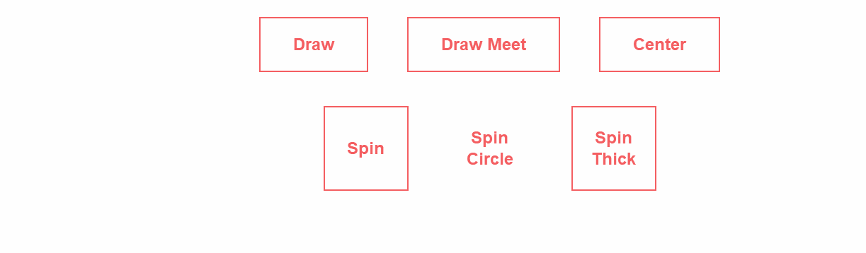
实现代码
html
CSS Border Transitions
css3
button { background: none; border: 0; box-sizing: border-box; margin: 1em; padding: 1em 2em; box-shadow: inset 0 0 0 2px #f45e61; color: #f45e61; font-size: inherit; font-weight: 700; position: relative; vertical-align: middle; } button::before, button::after { box-sizing: inherit; content: ""; position: absolute; width: 100%; height: 100%; } .draw { transition: color 0.25s; } .draw::before, .draw::after { border: 2px solid transparent; width: 0; height: 0; } .draw::before { top: 0; left: 0; } .draw::after { bottom: 0; right: 0; } .draw:hover { color: #60daaa; } .draw:hover::before, .draw:hover::after { width: 100%; height: 100%; } .draw:hover::before { border-top-color: #60daaa; border-right-color: #60daaa; transition: width 0.25s ease-out, height 0.25s ease-out 0.25s; } .draw:hover::after { border-bottom-color: #60daaa; border-left-color: #60daaa; transition: border-color 0s ease-out 0.5s, width 0.25s ease-out 0.5s, height 0.25s ease-out 0.75s; } .meet:hover { color: #fbca67; } .meet::after { top: 0; left: 0; } .meet:hover::before { border-top-color: #fbca67; border-right-color: #fbca67; } .meet:hover::after { border-bottom-color: #fbca67; border-left-color: #fbca67; transition: height 0.25s ease-out, width 0.25s ease-out 0.25s; } .center:hover { color: #6477b9; } .center::before, .center::after { top: 0; left: 0; height: 100%; width: 100%; transform-origin: center; } .center::before { border-top: 2px solid #6477b9; border-bottom: 2px solid #6477b9; transform: scale3d(0, 1, 1); } .center::after { border-left: 2px solid #6477b9; border-right: 2px solid #6477b9; transform: scale3d(1, 0, 1); } .center:hover::before, .center:hover::after { transform: scale3d(1, 1, 1); transition: transform 0.5s; } .spin { width: 5em; height: 5em; padding: 0; } .spin:hover { color: #0eb7da; } .spin::before, .spin::after { top: 0; left: 0; } .spin::before { border: 2px solid transparent; } .spin:hover::before { border-top-color: #0eb7da; border-right-color: #0eb7da; border-bottom-color: #0eb7da; transition: border-top-color 0.15s linear, border-right-color 0.15s linear 0.1s, border-bottom-color 0.15s linear 0.2s; } .spin::after { border: 0 solid transparent; } .spin:hover::after { border-top: 2px solid #0eb7da; border-left-width: 2px; border-right-width: 2px; transform: rotate(270deg); transition: transform 0.4s linear 0s, border-left-width 0s linear 0.35s; } .circle { border-radius: 100%; box-shadow: none; } .circle::before, .circle::after { border-radius: 100%; } .thick { color: #f45e61; } .thick:hover { color: #fff; font-weight: 700; } .thick::before { border: 2.5em solid transparent; z-index: -1; } .thick::after { mix-blend-mode: color-dodge; z-index: -1; } .thick:hover::before { background: #f45e61; border-top-color: #f45e61; border-right-color: #f45e61; border-bottom-color: #f45e61; transition: background 0s linear 0.4s, border-top-color 0.15s linear, border-right-color 0.15s linear 0.15s, border-bottom-color 0.15s linear 0.25s; } .thick:hover::after { border-top: 2.5em solid #f45e61; border-left-width: 2.5em; border-right-width: 2.5em; } /* Page styling */ html { background: #fefefe; } body { background: #fefefe; color: #4b507a; font: 300 24px/1.5 Lato, sans-serif; margin: 1em auto; max-width: 36em; padding: 1em 1em 2em; text-align: center; } .buttons { isolation: isolate; } h1 { font-weight: 300; font-size: 2.5em; }以上就是六种css3实现的边框过渡效果的详细内容,更多关于CSS3 边框过渡的资料请关注其它相关文章!
相关内容
- CSS3 实现的动态星空背景css3实现背景图片半透明内容不透明的方法示例css3实现背景图片颜色修改的多种方式css3制作的背景渐变动画效果CSS3实现模糊背景的三种效果示例CSS3 菱形拼图实现只旋转div 背景图片不旋转功能CSS3只让背景图片旋转180度的实现示例基于css3制作的圆形透明画中画视频播放特效JS+CSS3文章内容背景黑白切换特效代码css3实现简单的白云飘动背景特效
- 用CSS实现图片的3D凹凸感(凸出镜框外或凹陷镜框里)CSS3 3D酷炫立方体变换动画的实现CSS3之2D与3D变换的实现方法简单几步用纯CSS3实现3D翻转效果css3实现3D文本悬停改变效果的示例代码CSS实现卡片3D翻转效果的示例代码使用纯CSS实现书籍3D翻页效果的示例纯css实现照片墙3D效果的示例代码CSS3系列之3D制作方法案例
- 巧用 -webkit-box-reflect 倒影实现各类动效(小结)CSS3 Notes: -webkit-box-reflect实现倒影的实例
- 在CSS中映射鼠标位置并实现通过鼠标移动控制页面元素效果(实例代码)html+css+javascript实现跟随鼠标移动显示选中效果 利用HTML+CSS实现跟踪鼠标移动功能CSS实现鼠标移动到图片或按钮上改变大小的方法示例纯CSS实现鼠标移动切换图片示例
- 基于CSS3画一个iPhoneCSS3 实现NES游戏机的示例代码CSS3鼠标悬浮过渡缩放效果CSS3实现的文字弹出特效纯 CSS3实现的霓虹灯特效CSS3 实现的图片悬停的切换按钮CSS3实现三角形不断放大效果css3实现背景图片颜色修改的多种方式CSS3 制作的悬停缩放特效
- CSS3 实现NES游戏机的示例代码CSS3鼠标悬浮过渡缩放效果CSS3实现的文字弹出特效纯 CSS3实现的霓虹灯特效CSS3 制作的图片滚动效果CSS3常见动画的实现方式CSS3实现的水平标题菜单CSS3 制作的悬停缩放特效CSS3 制作的书本翻页特效
- css实现文章分割线样式的多种方法总结CSS巧妙实现自适应分隔线的N种方法
- CSS3鼠标悬浮过渡缩放效果
- 纯CSS实现hover图片pop-out弹出效果的实例代码利用HTML、CSS实现的图片预览弹出层的教程jquery+css3实现的鼠标滑过图片向上弹出放大效果
- CSS3实现的文字弹出特效纯css3发光霓虹灯文字闪烁特效代码CSS3文字图标组合悬停UI动画特效源码css3鼠标悬停图片3D翻页显示文字描述特效基于css3+svg实现的文字轮廓边框线条动画特效源码css3悬停文字交叉飘动切换动画特效CSS3实现的立体文字重叠动画特效源码CSS3+SVG实现炫酷的霓虹灯发光文字动画特效源码CSS3文字震动破碎特效源码CSS3实现的下划线跟随文字导航特效源码